The Countdown

Showing posts with label custom home. Show all posts

Thursday, July 31, 2014

Champagne Taste and [Craft] Beer Bottle Pockets


I am back!  Yes, I left because I may have mentioned that I am a wee bit superstitious.  We have been in a scary/fun/scaryfun stage of this process, and I have an irrational fear that if I wrote about it, and put it out there for the universe to laugh at me and teach me a lesson, the universe would do it.  The universe will mess with someone who writes something on the internet like that.  

Always start with the positive.  This morning we signed a construction contract with our builder and wrote that check that makes my stomach queasy, but in a good way (let's hope).

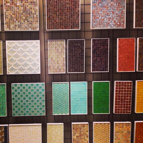
The fun part... We have been busy making all the detail selections you could imagine.  We visited the tile store and picked out tiles... which we had to reselect when we realized that some of our selections (stone made from volcanic ash anyone?) would mean we would have to choose which child to send to college.  And while I love my children equally, I did say goodbye to the soft-volcanoey-amazingness but it hurt a little because I am a total sucker for tile.


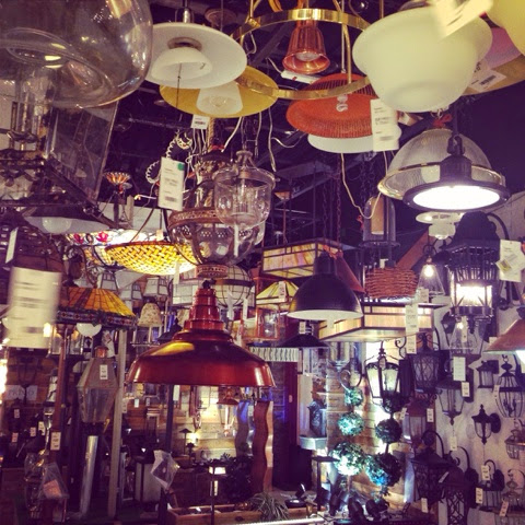
We went to pick out light fixtures which is always overwhelming for me because lighting?  It is a mood maker.  And I don't mean in THAT kind of way (although that too) but it can make you feel good, bad, lazy, energetic, whatever, with the flick of a switch or the tap of a dimmer.  It is not easy to get that right, especially when you haven't seen a physical space.  My biggest issue with our current house is the lack of "soft" light, whether it be reflected light or dimmer-controlled.  This probably sounds nuts to some people, but after the first priority of creating a functional and warm space for our family, the second priority to me in design is making a welcoming environment for entertaining.  Yes, both Andrew and I look at homes and think, how would you throw a party here?  Priorities!  Lighting is something I stress about before parties (Janet is clapping right now because she feeds this insanity :))


After we made a million selections, sent them all to the builder in a ridiculous string of emails, phone calls and pictures, we waited for a couple weeks.  Because we threw a ton of information their way which is all specific to us and not part of spec, and finding vendors, getting quotes and pricing it all takes time.  And during that time, we would make small changes here and there, but really, that is the time to put the keyboard down.  We had to stop looking at the internet, lest we make everyone including ourselves crazy.

The Scary Part...And then the day came when we got the list from the builder, The Price List.  Also known as dream-crusher day.  Ok, not quite, but it is the day I start to hyperventilate on because I know we have to make cuts and concessions in the name of not eating mustard sandwiches forever.  Andrew and I tend to have opposite reactions to this kind of thing, he was thinking the number would be worse, I thought it would be better, and the spreadsheet frenzy of budgeting and cutting began.  We went back and forth with the builder for a week, pricing and cutting and substituting and finally agreed on a number somewhere between what I hoped it would be and what The Price List was.

I am curious... When it comes to buying a home, what do you tend to do?  Do you stretch the budget to get what you want or do you stay in budget to avoid the financial crunch?  I guess it's all a question of your tolerance and the length of term for the investment, but I think we ended up somewhere in the middle.  There will be some projects for us after to add things we would like but are cost prohibitive right now.  I think that generally the bones of the house are close to what we envisioned.

Tomorrow we close on the lot, and word on the street is that we are hoping permits go through by the end of September.  Plans are already in engineering, so the countdown begins to construction.  May the City of Houston be ever in our favor.

Friday, May 13, 2011

If a Wood Chuck could Chuck

I've been holding out on you.

For a whole week now, we've had cabinetry installed, and I didn't divulge my filthy secrets.  Mostly because I didn't have photos, and I didn't go inside the house for a few days when a new lock was put on the door.  Blah blah lame I know.  But also!  We have trim work!  Tomorrow they should start interior painting, so with any luck, I'll have better photos up by the end of the weekend.

The plan for next week, Week 14, is to grade the lot, finish cleaning the cinder block outside, and hopefully begin painting the outside.  I'm not sure when the woodwork and floors will be stained, but my guess is not for several more weeks.  We've notified our landlord that we will be moved out of our rental house by July 25th, so now the pressure is on...


Week 13 - Le Dining Area.  I wonder if we'll actually use it as such, or if it will become the mail-holding-center like our current table.  The cabinets above the buffet on the left currently have incorrect fronts- they will be glass front for our "china" (loosely interpreted).

Week 13 - The Living Room and Stairway.  The front of the cabinets flanking the fireplace will be wire mesh front for an industrial element.

Week 13 - The Kitchen and Wet Bar (on the right).  I imagine most of our time will be here, near the food and booze.  I'm not sure what that says about us.


Week 13 - The controversial pantry configuration.  Everyone has an opinion about how functional this will be in reality.  So far, having not used it, I'm down with it.  TBD.

Week 13 - In front on the wall, the refrigerator will be on the left, stove in the center and ovens on the right.  The front right is the infamous coffee bar.  Don't even get me started on the un-ending hunt for the "right" refrigerator.


Week 13 - On the way to the 3rd floor, rail caps and door trim!  Look!  Doors too!


Week 13 - Lilly's bathroom: counters on the near left, toilet on the far left, bathtub on the far right, and teeny linen closet on the near right.  The door configuration isn't ideal, but you win some, you lose some. 
This bathroom didn't win.

Week 13 - The clouds part and angels sing.  The Master Closet, with more drawers than I have ever encountered in my life.  I am drunk on all the space.

Week 13 - The master closet "shoe rack" on the left (with adjustable shelving and the built in chest on the right.  Can I have a drawer entirely dedicated to shorts?  Or bobby pins? Or maybe even nail polish?


Tuesday, May 10, 2011

For the Love of Bathrooms

I posted on how I envisioned the kitchen interior design developing.  The only other rooms that I really have any convictions about are the bathrooms.  I don't know why they are easier for me to run with, but I have a feeling it's because I work better under pressure. 

We made a visit to Daltile way back in November to pick out all the tile for the house, to circumvent any delays should any of our choices have long lead times (surprise!  the custom tile choices for the kitchen did! minimum 3 months!).  A very helpful sales associate, Nicole, listened to me spout off my not-so-coherent thoughts, and then guided me to exactly what we wanted.  She was like a mind reader.

This being said, choosing tile gave me a spring board for the rest of the design, and it seemed easier to go from there.  I tend to picture how I would like a room to go better if I find one item/aspect I really love, and base the rest of the look off that piece.  And I may have mentioned that I love tile once or twice.

The Master Bath:
I realize this is not the most original concept, but to me, master bathroom's are most enjoyed when clean and spa-like in atmosphere.  If you can't afford to spend your day at the spa because you just threw all your money at building a house, then you may as pretend in said house. 
  • We picked white and green glass subway tiles for the shower walls, a matching mosaic tile for the sink backsplash, and a large scale rectangle grey textured tile for the floors. 
  • My favorite tile of all may be the shower floor, which is river rocks.  It's like a massage for your feet when you walk on it, and I am unnaturally excited about this small detail.  The shower is our most used piece, so the most space and money was focused there.
  • We also chose a free-standing tub (golf course not included) over a jacuzzi tub, being as that neither of us really uses a tub very often, and if we do, we really tend to shy away from the bubble action.
  • In sticking with our modern concept, we chose above-counter rectangle sinks (dual sinks!) with the Moen 90 Degree line of faucets.
I feel relaxed just looking at this collage.  Please pass me a mai-tai.
The Guest Bathroom:
Guest bathrooms need to be inviting and clean, and I prefer a little humor mixed in.  Are you sensing a theme here?
  • I kept it light with all white subway tiles lining the shower, against the polished concrete floor. 
  • We chose wall-mounted sinks that kind of have a retro vibe, and remind me of the sinks in my elementary school bathrooms as a kid.  Color me nostalgic.
  • The blue and white with pops of orange came out of me wanting a design that somewhat referenced a Grecian feel, without beating you over the head with the souvlakie.  The Greeks (or was it Romans?) did know how to do up a bath proper.

Kind of Greek, kind of random, but never boring.

The Kid Bathroom:
I don't know how possible it is to keep Lilly's bathroom clean, but I can hope in the conceptual phases, right?  If anything, it should be fun, appropriate for a kid, but something she can grow into as well.  I'd like to not have to remodel it until she's a surly pre-teen if possible.  We went with the neutral white subway tiles again in her bathroom.

Art in a kid's bathroom is paramount.  More so than soap.
The Powder Bathroom:
This room was a little more difficult because location wise, it is the link between the kitchen and the living room, so it has to be complementary to both.  I have ideas about the kitchen, but the living room is still too daunting, so it's like trying to design somewhere between everything and nothing at the same time.  This room is still the most questionable, but I found a funny print I couldn't resist, and it has become the jumping off point for the rest of the tiny room.  Because if you're using the bathroom at someone's house, you always appreciate the ability to judge that person on available reading material.  Ahem.

I don't know where the purple/yellow thing came from, I just ran with it. 
It looks like I ran with it right into Mardi Gras

That wraps up our bathrooms.  Did I spend way too much effort/time considering these are just bathrooms?  You're probably right.  How do you decide how you want your bathroom to look?

Saturday, April 16, 2011

The Kitchen: Start with the Heart.

A lot of the posts thus far have been about the body of the house - the skeleton, the guts, the skin, etc.

It's high time we discuss my favorite part. The house's outfit, or interior design.

I should say that this is by far the most overwhelming part of this process to me. Ridiculous I know - who cares about a few throw pillows and a rug? I don't think I have terrible taste, but I also know I have a tendency to get carried away and end up with madness that induces acid flashbacks. I like color, and I'm not shy when I use it. However, I can tell that as I've gotten older {i.e. terminally uncool], my taste has evolved, and I do want something a little more sophisticated, without loosing that sense of humor and boldness that I feel reflects our goofiness as people. I'm no designer, but I want to put together something that we love, that is comfortable and practical, and that we won't be sick of in 5 years. Is that possible?

So funny enough, when I picture the rooms in my head, the easiest rooms to put together are the kitchen and bathrooms. I couldn't even touch the living room and the bedrooms for months, and I'm still slowly trying to put them together. This isn't even REALLY putting together, this is just on-paper-putting-together, in theory with mood boards. I'm a visual person, so I find it easier to put things together when I see them, hence the collage style. Not all of the pieces shown in the photos will necessarily be in the room, but then reflect the feeling/style/color palette I'm going for, so please don't take it literally.

Without further ado, Voila! Le Cuisine!


Design roughly began with the tile selection. My love for tile is well documented. I found a photo from a tile designer online which I loved, copied the photo into a random drive on my computer, and then proceeded to lose the designer and photo online forever. I knew I wanted a colorful subway tile for the kitchen back splash, so I did my best to re-create that photo (now in my head) with custom tile selections. The colors in the mood board above don't reflect the actual colors of the tile very well, that is the problem with colors on the web - nothing is exact, and everything is subject to the individuals screen. Basically, I was going for a chocolate brown, mustard yellow, tangerine, cherry red and salmon pink color. A very autumn color palette, but that is what makes sense to me in a kitchen. After deciding on these colors, I read somewhere that red and yellow induce hunger in people, which makes sense if you're whipping up delightful grub.

After looking at many counter top options, we decided on sile stone for several reasons:

1) It is durable.
2) It is contemporary.
3) It is good quality.
4) It is less expensive than some of the other options we liked (hi recycled glass counter tops, I'm looking at you)
5) It is virtually maintenance free, not needing to be sealed like granite.

We went with solid white, as we figured the counters needed to be simple and clean, in contrast to the colorful crazy back splash.

If you are into appliances, I will have to direct you to Andrew. He was like a kid in a candy shop that day. He kept asking my opinion, and I tried to be thoughtful and appreciate his enthusiasm, but the only genuine question I asked was "how difficult is this item to clean?" There are apparently very real differences between each brand and model, I just can't speak at a level beyond boiling water, so none of it really means much to me. Sad. There were some Miele and Dacor and GE items thrown into the mix, but that's as far as I can really decipher.

The bar area, dining area and kitchen all go together, so they all have to coordinate. To me, the bar back splash had to be a little sexier, a little more masculine, so we went with metallic penny rounds over the white sile stone.

All the cabinetry will be the same throughout the house - a dark stain, flat panel cabinet. I know we picked out hardware, but my memory fails me on what exactly it was at this moment. Something modern but simple I know. The floor is also going to be sand and finish, dark stain wood through the second floor to coordinate.

We are looking at wallpapering one wall in the dining area with a damask print, which apparently is a very polarizing move. We are not stupid enough to hang wallpaper ourselves (again.), but would hire a professional. We like Graham & Brown's lines, but this is still up for debate. The Ochre print above is the front-runner thus far. Thoughts? Have we completely lost it to even consider this?

You will shake your head in dismay, but most of the kitchen was designed (in layout) around a pot rack we got as a wedding gift and the orange Kitchaid appliances we also received as wedding gifts. It all had to work together. What do people typically design their kitchen's around?

The lighting had to be fun, we knew we wouldn't be happy with any of the standard options. We found the Nelson line of pendants on HGTV's Design Happens, and waited until they went on sale at a local shop to buy it. Yes, our current dining room is becoming a storage facility for such items until they are ready to go to their home in our future home. We eat amidst the light bulbs and tile samples. Ahem.

The red pendant was a find on CB2.com, and we chose 3 of them to hang over the kitchen island/peninsula for additional spot-lighting. They are simple and loud, but we love the retro-look of the Edison light bulb, and the industrial feel of shadeless hanging bulb.

The bar stools we found last week at IKEA, and liked the mid-century clean look, and the comfort factor was there. They even pump up and down to adjust the height. Lilly enjoyed playing on them until we had to drag her away. T

hat's all we've got thus far on the kitchen, but I feel good about where it's going. I realize this will always be a work in progress - that design isn't an immediate destination, it is always evolving, no matter how much I want to just "get there." Knowing me, by the time I get there, "there" will have changed meaning anyways.

Tuesday, March 22, 2011

The Guided Guts Tour

Reconciling on of yesterday's snafus, we have the correct siding being installed today.

Week 6 - Smoothness preferred.

So it's about time to introduce you to the guts, the glory, and the mess that is the inside of our house thus far. I take no blame for this mess, however. At a minimum I need to document for posterity.

Week 6 - You walk in to our front door, and the door to your left leads to the wonderful, spacious 2-car garage. For someone who has never had this much parking space before, it is a luxury. In the corner, we added a mop-sink connection for those days when Lilly doesn't earn a hot shower. Just kidding. Kind of.


Week 6 - To the right on the first floor is the guest bedroom and guest bathroom. This is how we hope to entice people to visit us. Hi, you don't have to sleep on the couch anymore, please come see us!


Week 6 - When you go up the switchback stairs, on your far left you find the dining area. It's a narrow room, and there will be a buffet and some built-ins on the far wall between the double windows.


Week 6 - Next to the dining area is the kitchen, the Man Cave in all it's glory. Using your imagination, we'll have a "peninsula" in the middle to sit at, which is connected on one side to the pantry, and on the other to the coffee bar. I don't drink coffee, so you can tell who's idea it was. I just demand some kind of cocoa or tea option.


Week 6 - Looking past the kitchen "peninsula" there will be the wet bar and powder room. Where there is alcohol, there should always be a restroom nearby. Experience.

Week 6 - Past the powder room, down some stairs and adjacent to the living room is the entrance to the balcony. If we're spending 80% of our time on the 2nd floor, then I plan on spending 89% of that time out here.

Week 6 - The Living Room That Was A Lot Narrow Than We Pictured. I refuse to buy furniture for this space until we're in because I get hives when I think about things I picked out in my head not fitting.

Week 6 - Moving up to the 3rd floor, on the far left is Lilly's room. She has the best view of the Magnolia trees in the behind-neighbors yard.

Week 6 - The Woman Cave/Office. I know it's tiny, but it's mine, and I can't wait to set up.

Week 6 - And here's the Master bedroom. The best part is the slanted ceiling and windows. If we ever furnish this room, it will be the first time both Andrew and I have had REAL furniture in our bedroom since we were kids. Fingers crossed.

Week 6 - What's this? In the Master is this super secret door that won't actually exist. We framed out for resale in case someone wants the office to be connected to the Master as a sitting room/weight room/yoga room, you name it. Always thinking ahead.

Week 6 - This is a very poor photo of the Master bath, which is not sprawling by any stretch of the imagination, but it is leaps and bounds bigger than anything Andrew and I have shared thus far. For us, double sinks are a huge upgrade. On the left is the shower, and behind it the toilet room. On the right is the free-standing tub and the door to the closet. Straight ahead under the horizontal window is the double sinks.

Week 6 - And we end on the high note - the Master Closet. My brain explodes with the possibilities when I look at this space because it is approximately 4,594,305,439 larger than our current clothing storage options. And you bet your Loubitins there will be a wall of shoes. It's only proper.

Monday, March 21, 2011

Whoops and Uh-Oh.


Week 5 - Skin attached, now we have rooms!

Week 5 - I double-dog-dare you to walk on that scaffolding.

As of last week, all the sheets were place on the exterior, so we are one step closer to being dried in. The next step is doing the Tyvek (vapor barrier) and then siding, and in our case, concrete block. Don't forget the roofing! And given this step in the process, it seems appropriate to go over a few of the "Doh!" moments we are having right about now, with the Builder.

Uh-Oh Numero Uno: Guest Closet Door


When we designed the first floor, we were conscious of minimizing the first floor footprint. That seems counter-intuitive given it is the bottom of the structure, but given that it would be the least used space (guest quarters), we didn't want to use a lot of square footage [read: $$$] in the area. In order to be efficient, we decided to use the space under the stairs for dual purpose, as it would normally be wasted space. From the garage side, we had built in shelving added under the stairs in the wall for extra garage storage. From the guest room side, we decided to use the space as the closet on the high end, and a storage for luggage on the low end, under the mid-way stair landing.

Needless to say, we anticipated the "high end" would indeed be much higher and less "cut" by the slant of the stairs. [Note: It is REALLY DIFFICULT to picture stairs in 3D from a 2D rendering.] Originally in the plans, there was supposed to be a pocket door to close off the closet. Given the high angle slant, that isn't possible, so we've had to think of other options for doors there. Right now, the barn door is winning, although it is a little pricier for the hardware than I would have liked. (Let's all open our wallets together now, shall we?)

Uh-Oh Numero Dos: The Wrong Siding Arrives


Because we are going with a modern/contemporary design (can someone tell me the difference between the two terms?), we ordered smooth concrete siding in alternating 10 and 6 inch boards. However, what arrived on the site today was an wood-texture plank that is very common in traditional homes. Way to catch that before it went up today Andrew! Boo that now we have to wait for the correct siding to arrive.

The siding will go on the 3rd floor of the house, and cinder block will be the bottom 2 floors of the house. That makes the walls on the bottom 2 floors of our house a foot thick - practically bomb shelter. Let's just hope we never have to use it as such. Ahem. This brings us to...

Uh-Oh Numero Tres: Does Cinder Block Float on Air?


Here we are looking at what will eventually be our balcony. We've recently had disagreements over what the inside of the balcony is supposed to be covered in materially - cinder block (what we understood) or siding (what the GC understood). Although it is very difficult to catch every little thing during design, there were several discussion about this topic during design because the weight of the cinder block meant using steel beams [read: $$$] in the garage ceiling. It was our understanding, in a conversation with the Builder, that is was going to be cinder block, but somewhere along the way to the GC, that never was clarified or communicated, by ourselves or the Builder. So as of now, the balcony is built and supported for siding, not cinder block.

We can get over that; however, we believe there should be some give and take. It also became apparent on Friday that we did not have in mind the same material make-up of the fireplace and mantle area. We intended for cinder block (the same as the exterior) from the floor to the mantle, while the GC understood it as only around the trim of the fireplace. It doesn't appear that either side clarified during design, and this is another lesson in the importance of nailing down the details as precisely as you can early on in the project. We're hoping for leniency on the fireplace material in exchange the siding on the balcony.

If you look at the photo above, there is a 6 inch lip above the header over the balcony. The lip is the bottom of the 3rd floor, and is hanging over in order to have the siding on the 3rd floor flush with the thick cinder block on the 2nd floor. The lip is an indication that the header over the balcony is to be covered in cinder block, however, we're not sure how that can be achieved physically speaking. The cinder block would have to "float" unsupported over the open balcony, unless steel plates are put in to support it. Thus far, we have heard nothing of steel plates. If siding is put in instead (not good) an awkward transition occurs between the 2nd and 3rd floor, as well as the west and east halves of the house. My anal-retentive detail-oriented side starts to twitch when I think about this too long.

Monday, March 14, 2011

Like a Complex Game of Pick-Up-Sticks

Framing was finished last week, which means we got to walk around all 3 floors, and introduce Lilly to her future bedroom. She was stoked, and I'm sure she understood exactly what was going on [i.e. she is increasing her real estate value].

So comparison time. Here is kinda-sorta what this is ideally supposed to look like eventually:

Plan view, dressed up with colors, kind-of.

And here is the match stick version:

Week 4 - The Light coming in the Attic.

Week 4 - You know that guy is sick of treking all those boards up 4 flights of stairs.


These photos don't include the finished roof joists and hurricane clips/straps, but you get the general idea. On the top floor is the master bedroom, Lilly's room, The Woman Cave, and the laundry room (and no, those last two aren't the same thing, thanks for asking).

Why a Woman Cave you ask? Many houses have a Man Cave right? The garage or a den or a media room, maybe. Andrew's Man Cave is the kitchen, and he had a ball with that one - picking appliances, counter tops, and the exact hinges for the pantry slide-out thingies. So the small room known affectionately as the Woman Cave is an office, that I hope to set up with our computers, all the electronic doo-hickies, books, photography equipment and design inspiration. Fingers crossed that it doesn't become a "junk room"; my track record isn't good.

This week, Week 5, we hope to have the roof started. The goal is to move quickly to get the house "dried in" so that we can not have to worry about weather delays. May the Weather Gods continue to look with delight upon us. I will now show my unending appreciation to them all with a rain/sun dance. Just kidding, I wouldn't do that to y'all.

Friday, March 11, 2011

I Spy.

The third floor started today, and tomorrow it should be finished up (even though I'm surprised they're working on the weekend). Hallelujah the framing is almost done. I feel like we're borderline staulking the house at this point, and at any moment the construction crew will file a restraining order against us.

Week 4 - I spy a third floor, i.e. the "Nighttime Floor," complete with bedrooms.

Because we visit the site several thousand times a days, the neighbors have started to come out and introduce themselves to us more and more. [Meet the Staulkers, starring the wackjob couple and screaming toddler. Hah. hah. hah.] Everyone has been really nice and welcoming, and everyone also tries to restrain their curiousity - some are more willing to ask details about design than others. For obvious reasons, no body wants a huge pile of Ugly next door.

We got bad news however; the neighbors directly next door to us, the ones whom we have been in contact with, learning from and growing closer to this whole time are putting their home up for sale next week. We were crushed, especially when we heard they just seperated. There is a whole lot of the "D" word going around right now, and it seems to hit hard to witness it (I can only imagine the pain of an actual participant). We are hoping for equally great neighbors to move in, so if you're in the market for an amazing piece modern house, custom done by a talented architect (the owner himself), it is worth a look. If only to see the sprawling master suite and tub.

Plus I've heard the neighbors aren't too bad.

2nd Floor, 1st Pietro

The end of the week was marked with a second floor! The big surprise? Holy cow we ordered big windows. The framing is in for the windows on the bottom two floors, and we didn't realize how obsessive we got during planning with having big picture windows. We did upgrade our windows to Pella windows because I was stubborn that I wanted European-style casement windows, and we were both adamant on having energy efficient windows.

Also, we see how big the balcony is, which is about how I pictured it: enough to have a small group of family or friends over for a dinner/cocktail party "on the terrace." Look how fancy I aspire to be.

We're hoping to work on the 3rd floor today, and start on roofing next week. May the weather be in our favor!

Week 4 - The "Daytime" Floor.
I suspect we will spend 80% of our time on the second floor.

Week 4 - "Terrace" Action

Week 4 - The view from our kitchen windows.
Let's try to ignore the 8 million electric lines outside, okay?


Tuesday, March 8, 2011

Movin' On Up

The stairs and decking for the second floor, along with some of the framing was done today. The crews work until there isn't enough day light, which means us making our evening run to inspect leaves little light for photos. We are slowly picturing how our life will unfold in the spaces, and I can't wait to be in it, live in it, make memories in it.


Monday, March 7, 2011

Sticks and stones won't break these bones, but change orders can hurt me.

It happened! We have framing! The project is now 3-D with verticalness!

For the first time, we are able to "feel" what the space is like. Another words, we can walk around saying, "I thought this was going to be bigger" or "this ceiling seems taller than I pictured." Because we did the design ourselves, we've never (nor anyone else) seen it in model form. One of my biggest fears was that what we have conceptualized to death in our heads and on paper wouldn't translate practically to physical space. We've only got one floor up thus far, lovingly referred to as the "guest quarters," but so far so good. I'm sure it will all change again once it's closed in with dry wall.

The plan is to have the second floor tomorrow and the third floor done on Thursday. If we're lucky, some of the roof will be done by the end of the week.


Week 4 - That is one brave man standing on top of our guest shower.

Saturday, February 12, 2011

Awesome! NOW what??

We resume!

The next morning, Andrew wakes up to a new email from the seller, and the first line states:

"Congratulations, we have decided to take your last offer in the amount of $[truckloads of cash]!"

Woah, what? I thought we walked away and it was all over. Switch mental gears again, now we're really excited. Jumping up and down excited. And this is followed by the complete rush of "holy schmidt, now we really have to do this." Wait, are we really going to build a house? Is that even possible? WHAT ARE WE DOING?!?

We hadn't really done any research on what it take to build a home at this point. During the period before closing on the lot, we spent time meeting different architects, some we found online, others were recommended by neighbors or friends. To some one who would consider designing their own home, I would highly recommend to interview many architects. because there is a wide range of approaches, price ranges, styles and comfort levels. We heard everything from, "bare bones, no real flooring, it is impossible to do this project for less than $175 per square foot" (!!!) to "what's your budget? Yeah sure we can do that."

Even though budget was really important to this project, the style of the architect and how well you connect with them is key to sanity. The truth is, you're choosing a relationship, and it is one you will pay a dear amount for, so you better like that boyfriend/girlfriend with a pencil. Looking for an architect was a roller coaster ride for us; some days we thought there was no way to make this work, others left us hopeful. Even after we closed on the lot, we continued to look, and eventually after several months we came to a few realizations about what we were looking for.

Andrew and I had a good idea of what we wanted the design of our home to look like. In reality, our lot is pretty tiny, space is a major constraint, so there weren't a whole lot of directions to go but up. We drew up countless layouts in Microsoft Visio, and it's humorous now to think where we started, and where we ended up in design. The first house was a mansion, straight out of one of the countless home design magazines that took over our kitchen table for several months.

We were fairly confident that we knew what we wanted and we could draw it ourselves, we just needed someone with experience to guide us through the logistical details: how much space is needed for HVAC, where is the best location for conduit, how practical are tankless water heaters, etc. So what was the point in paying an architect to draw up plans that we had 95% already drawn up ourselves? When we designed our home, we didn't reinvent the wheel, and weren't looking for any front-page accolades in Architecture Digest. We wanted a home that fit our style, our family, how we live, and how we wanted to grow.

It's a personal decision for everyone, but we decided against an expensive architect, and went with a small builder (under 50 homes a year) who has a long list of excellent references, and has an in-shop architect. That is probably not a popular choice for architects, but given the work we had done already on our own, we wanted to make the most of our resources [read: cash] and paying a $15 - $45K fee to have someone re-draw what we had drawn, or worse, scoff at our design from an artistic standpoint, did not sound appealing. Going through the design process with the in-house architect was easy, not intimidating and enlightening in a lot of ways, and at this point, I can say I am happy we took this route.

Of course, I say this before we have seen any physical manifestation of our home, so here's to hoping we are still happy with the design when we see it live...